Review PromoForum

Status
Not open for further replies.

Amanda

New member
Joined
Nov 16, 2015
Messages
27
Points
0
Before reviewing my site, please keep in mind the site is under two months old. Also take into consideration what the forum looked like before this theme (support.proboards.com [default PB theme]). Myself and my co-conspirator have worked our butts off for over a month to bring something different and unique to a ProBoards hosted forum. We're still working on things behind the scenes especially the home page. But, We'd still love to hear opinions on the site as a whole including the design. Thanks for your time - promoforum.net
 
Last edited by a moderator:

Harry P

New member
Joined
Feb 3, 2015
Messages
331
Points
0
Overall looks good, clean and easy on eyes. I like theme layout too.

I don't really understand the icon in you logo, what does it mean?

You can consider to move "Latest Posts" above "Status Updates" so that it's easier to follow for members and visitors.
 
  • Like
Reactions: Amanda

Amanda

New member
Joined
Nov 16, 2015
Messages
27
Points
0
Amanda
Thank you for the feedback Harry! I'll look into having that done tomorrow. It does make more sense. The logo icon is an owl wearing glasses and holding a book. It symbolizes wisdom and such as owls are "wise" creatures. So it fits the Webmaster-ish niche. Also, I updated the first post with a link to the softwares support forum that shows you a general idea of what the default theme actually looked like before customizations.
 

wms

Administrator
Staff member
Joined
Jul 7, 2012
Messages
848
Points
63
If I was you I will improve immediately the homepage (promoforum.net) and never leave a "Coming Soon" section like that, making some interesting sections for the home page and link them to promoforum.net/forum

About Us on home page, you can remove it and should put it in a page...do the same for PromoForum News & Announcements

On your forum, you can need to add users' avatar beside Last Post to make it more attractive and look better.

On Members of the Month and Today's Birthdays (the image on the right), decrease size for images, you know in the design, which is important then must be bigger and vise versa, right?

Removing banner ads at the bottom of forum, you will put it back when you sold the spot (banner ads) on the top..its the way you should go with :)

More things I will suggest you to improve your forum but may be later, its enough today :friends:


Cheers, :drinks:
 
Last edited by a moderator:

PTTed

New member
Joined
Jul 15, 2015
Messages
392
Points
0
I think your forum is off to a good start.

When I visited it I found myself wondering something. My understanding is that your site is created to help website owners (mainly forum owners, admins and bloggers) advertise their websites. If that is the case, wouldn't those people want to advertise their sites to their target audience rather than advertise it to other website owners?

I guess if a person has a website that targets other website owners, then it might be an effective place to advertise. If a person is running a forum about some other niche topic though, is that going to be an effective way for them to advertise?

Am I missing something?

Here is an analogy. If I was an accountant looking for clients I probably wouldn't spend time and money advertising my services to other accountants. I would want to advertise to business owners or other specific segments of the population that I think are more likely to hire an accountant. Do you know what I mean?
 
  • Like
Reactions: roggy

Amanda

New member
Joined
Nov 16, 2015
Messages
27
Points
0
Amanda
The purpose, or focus, of PromoForum is not just to advertise. It's to help members in general to gain new members, content, comments, etc. There are may aspects or purposes for the forum in general. Hence the services sections. Advertising on the site will lead to finding other sites of the same genre as we don't limit the type of of genres we allow (within reason). And, therefore, advertising with PF will indeed bring our members potential users to their sites and projects.
 

Gustav

New member
Joined
Aug 24, 2012
Messages
40
Points
0
I found it hard to register on your forum when its requiring many steps to finish the registration. You can combine all steps into a step on a webpage?

Just my 0.2 cents!
 

Amanda

New member
Joined
Nov 16, 2015
Messages
27
Points
0
The steps aren't really that hard to follow @gustav. You enter an email address and password, then a username. You then have to wait until registration has been verified if you've never linked your email address to a ProBoards global account. After that, you won't have to activate your email again on any ProBoards forum so long as you link that email with any ProBoards forum account. As for combining steps, it's the software. I cannot change the backend stuff as no ProBoards administrator has access to it.
 

PTTed

New member
Joined
Jul 15, 2015
Messages
392
Points
0
The purpose, or focus, of PromoForum is not just to advertise. It's to help members in general to gain new members, content, comments, etc. There are may aspects or purposes for the forum in general. Hence the services sections. Advertising on the site will lead to finding other sites of the same genre as we don't limit the type of of genres we allow (within reason). And, therefore, advertising with PF will indeed bring our members potential users to their sites and projects.
Ok. I get it.

I think you might want to rewrite your "about us" section and make the benefits of joining the forum more clear. I would also make that section of your homepage more eye catching by changing the background color or something so that people are drawn to it right away. Then use that section as a sales pitch for who should join the forum and what benefit they will get from the forum.

Something like this perhaps:

We are a community of website, forum and blog admins. Join our forum and we will help you get more traffic, comments, discussions and high quality conversational content for your website. If you are trying to build a thriving community at your website, we can help you do that. Join us today.
 

itsmyluckyday

New member
Joined
Mar 21, 2015
Messages
7
Points
0
Site looks good, clean and easy on eyes. Your problem is you need to fill more content to forums, it will make your forum busy and active.
 

Samm

New member
Joined
Dec 27, 2015
Messages
38
Points
0
First of all, good work and on continuing to improve your forum site. It's great that you have a few associates and friends assisting in fostering community as that can be very hard initially.

The first thing I noticed was some spacing is off here:
spacing.PNG

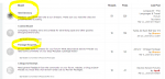
You can use Stylebot extension (Chrome) to figure out what div tag is causing this issue and change padding/margin.

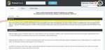
Second, I realized I still didn't know what the site was about - it just didn't stick out in my mind. That's because my first impression of the site was a page of text on the forum home page itself. Here's what it's like right now:

image.jpg

I highlighted the area where I think you could drop in a pretty graphic with your owl character. Perhaps you could have something like this:

concept with main site.jpg

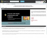
The advantage of having an image is improved understanding and recall. Sometimes it's useful to use a photograph of your ideal client (a woman or a man, a younger man or a younger woman, depending on type of visitors you get) next to a headline. Then list in the most specific and clear words what benefits they will recieve. You can also mention a problem that your ideal visitor is facing - "Don't wait for traffic to come to you. Promote your site with friendly enterprenuers" for example.

The small text alone without a graphic on the landing page isn't enough in this case. As I said earlier, the impression of my first visit was "what does this site do again?" - Visitors shouldn't be asking : )!

I had the same exact problem with one of my own sites, where I had assumptions about what was important to fix on my site...however, I had completely overlooked the simplest thing: what my site does, clearly explained with a graphic or headline. Otherwise, the visitor can't continue : "did I land on the right site? "
 
Status
Not open for further replies.
Older threads
Replies
3
Views
1,954
Replies
12
Views
3,625
Newer threads
Replies
16
Views
5,844
Replies
9
Views
4,410
Replies
11
Views
5,345
Latest threads
Replies
0
Views
115
Replies
2
Views
314
Replies
4
Views
401
Similar threads
Replies
1
Views
1,357
Replies
2
Views
2,964
Replies
1
Views
2,594

Latest postsNew threads

Referral contests

Referral link for :

Sponsors

Popular tags

You are using an out of date browser. It may not display this or other websites correctly.
You should upgrade or use an alternative browser.

Top